
Python I Data Analysis I Visualization Course I Certification

Brainmeasures Data Analysis and Visualization with Python Course and Training
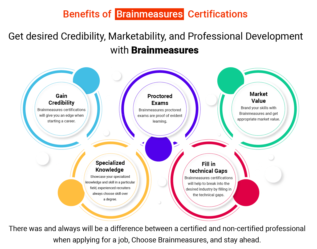
What you will learn
Visualizing data is an essential skill that can benefit professionals across a range of industries, from marketing and finance to healthcare and government. Python is one of the most popular programming languages for data visualization due to its powerful libraries and tools, such as Matplotlib, Plotly, and Seaborn. By using Python to create compelling graphs and charts, data analysts and scientists can present their findings in a way that can be easily understood by both technical and non-technical audiences. In conclusion, visualizing data with Python is an effective way to communicate complex information and tell compelling stories with data
Possess intermediate Python programming abilities.
Jupyter Notebook Environment is to be used.
Create and modify arrays by using the numpy library.
To create and organize data, use Python and the pandas module.
Learn how to use JSON, HTML, and MS Excel worksheets as well as other data formats in Python.
Python-based data visualizations can be made using matplotlib and the seaborn modules.
Have a portfolio of different initiatives including data analysis.
Enroll for the Brainmeasures Data Analysis and visualization using Python video course and secure your future with a great job.
Data Analysis and Visualization
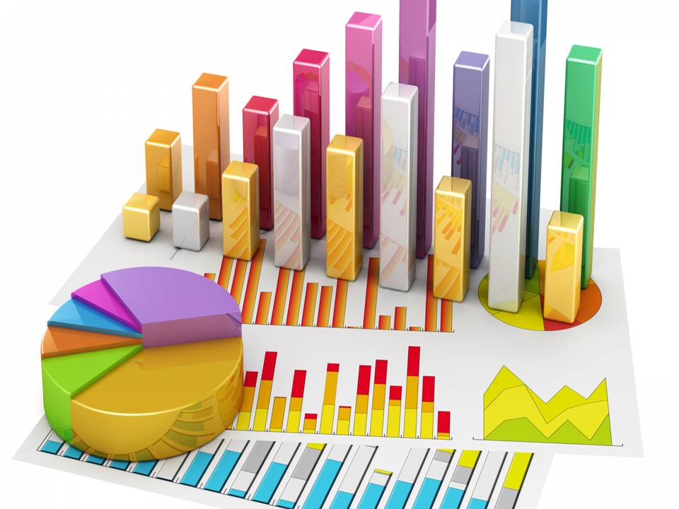
5 Data Visualization Techniques Every Python Data Analyst Should Know
If you're a Python data analyst, you know that data visualization is a crucial aspect of your work. Visualizing data helps you understand patterns, trends, and relationships in your data, making it easier to draw meaningful insights and communicate your findings to others. But with so many visualization techniques out there, it can be overwhelming to know where to start. That's why we've put together a list of five essential data visualization techniques that every Python data analyst should know. From scatterplots to heatmaps, we'll walk you through each technique, providing examples and tips for how to implement them in your own data analysis projects
Introduction to Data Visualization Techniques
Data visualization is a crucial component of data analysis and is increasingly becoming a popular tool for businesses and individuals alike. Simply put, data visualization refers to the representation of data in graphical forms, such as charts, graphs, and other visual aids. The importance of data visualization lies in its ability to convey complex information in a clear and concise manner, making it easier to digest and understand. With the help of data visualization tools, we can analyze large data sets and uncover hidden patterns, trends, and relationships between different data points. This enables us to make better-informed decisions and take appropriate actions based on the insights gained from the analysis. In short, data visualization is a powerful way to make sense of complex data and has become a necessary skill for professionals in various fields.
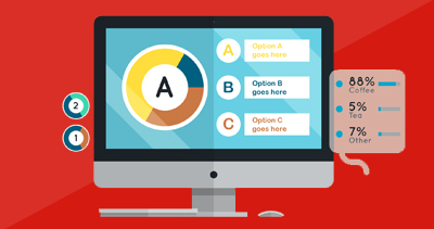
Data visualization is a crucial aspect when it comes to analyzing and communicating information efficiently. Machine learning has become an essential tool for data visualization, and the most common types of data visualizations include bar graphs, scatter plots, line charts, heat maps, and pie charts. Bar graphs are ideal for comparing different sets of data, such as sales figures. Scatter plots are perfect for identifying trends and patterns in large datasets. Line charts are suitable for illustrating changes over time, while heat maps are ideal for showing where the concentration of data lies. Pie charts are effective for displaying percentages and proportions. Each type of chart has its unique advantage for displaying information in an organized way, and it is essential to select the appropriate type of visualization for the specific data set. With machine learning, data visualization has become more efficient and effective in providing insights into complex data sets.
Useful Data Visualization Strategies for Python Data Analysts
As a Python data analyst, having a solid grasp of data visualization strategies is an essential part of the job. This is because it enables analysts to clearly communicate complex data patterns in a manner that is easy to understand for stakeholders. One invaluable tool available to data analysts is the Numpy Library. Numpy stands for Numerical Python and is widely used for scientific computing and data analysis. It provides powerful data structures and functions, particularly for numerical operations. With NumPy, Python data analysts can perform a range of mathematical operations to compute and manipulate data sets, which are often required for effective visualization. Therefore, understanding how to incorporate numpy into data analysis is critical for creating impactful and insightful visualizations.
When working with data, one of the most vital strategies is to incorporate appropriate visual elements. Color, size, and shapes can all be used to help readers better understand the message behind the data. By using graphical tools like boxplots, scatterplots, and bar graphs, the data can be presented in a way that provides further clarity for the audience. Incorporating these elements can help highlight trends or relationships in the data, making it easier to grasp. Knowing how to work with data means understanding its importance and finding ways to present it in a visually appealing and easy-to-understand way. Taking the time to incorporate these visual elements properly can help ensure presentations of data are both informative and effective.
Also, it is important to note that creating interactive visualizations can bring a whole new level of engagement to the data being presented. Interactive visualizations can provide users with a more immersive experience and allow for a more meaningful interpretation of the data. Visualizations can be used to identify trends, patterns, and outliers, making it easier to draw conclusions from complex data sets. By incorporating interactive elements into data visualization, users are empowered to explore and analyze information in a more dynamic manner. In conclusion, using interactive visualizations with tools such as Plotly or Seaborn is an effective way to communicate complex data in a more accessible and impactful way, allowing audiences to gain deeper insights into the data being presented.
Expected Salary
The average data analytics and visualization professional salary in the USA ranges from USD 70,000 to USD 89,000 (INR 50,00,000 to INR 60,00,000). This makes the average salary around USD 79,500 (INR 59,40,000)
Data visualization is an indispensable tool for any Python data analyst. By leveraging the power of visual communication, you can unlock hidden trends and patterns in your data that might otherwise go unnoticed. With the essential techniques taught in the Brainmeasures course, you have a solid foundation from which to explore the exciting world of data visualization. Remember to keep your audience in mind, and don't be afraid to experiment with different techniques until you find the ones that work best for your particular use case. With the right tools and a bit of creativity, you can turn even the most complex datasets into visually stunning and informative graphics that tell a compelling story.
| Getting Started | 11 lectures | 17 mins |
| HTML and foundation | 11 lectures | 17 mins |
| Some title goes here | Preview | 01:42 |
| Welcome guide document | 10 Pages | |
| Some title goes here | 07:42 | |
| 2 Some title goes here | 07:42 | |
| Hello Some title goes here | 07:42 | |
| This is Some title goes here | 07:42 |
| CSS and foundation | 17 lectures | 87 mins |
| Some title goes here | Preview | 01:42 |
| Welcome guide document | 10 Pages | |
| Some title goes here | 07:42 | |
| 2 Some title goes here | 07:42 | |
| Hello Some title goes here | 07:42 | |
| This is Some title goes here | 07:42 |
| Making Responsive Website | 17 lectures | 87 mins |
| Some title goes here | Preview | 01:42 |
| Welcome guide document | 10 Pages | |
| Some title goes here | 07:42 | |
| 2 Some title goes here | 07:42 | |
| Hello Some title goes here | 07:42 | |
| This is Some title goes here | 07:42 |
| Learn Sass less Scss | 17 lectures | 87 mins |
| Some title goes here | Preview | 01:42 |
| Welcome guide document | 10 Pages | |
| Some title goes here | 07:42 | |
| 2 Some title goes here | 07:42 | |
| Hello Some title goes here | 07:42 | |
| This is Some title goes here | 07:42 |
| Learn about Cpanel and file uploads | 17 lectures | 87 mins |
| Some title goes here | Preview | 01:42 |
| Welcome guide document | 10 Pages | |
| Some title goes here | 07:42 | |
| 2 Some title goes here | 07:42 | |
| Hello Some title goes here | 07:42 | |
| This is Some title goes here | 07:42 |
Enroll in this course now and avail all the benefits.

Learn One-to-One Live Course - Coming Soon.


Brainmeasures certified Professionals work with global leaders.


The video online course is well-structured and comprehensive.
The topics are organized in proper sequence to enable the candidate understand them easily.
Easy to understand and implement in real life.
Sufficient pictures, tables, graphs have been provided to make this online Course more attractive to the readers.
Final certification exam conducted under surveillance of trained human proctor.
We will ship your hard copy anywhere you ask for.


913888 Enrolled 03:12 Total Hours
$39
1111291 Enrolled 20:40 Total Hours
$39
Take free practice test now
In today’s corporate world, a single wrong decision can cost you millions; so you cannot afford to ignore any indemnities you may incur from a single wrong hiring decision. Hiring mistakes include the cost of termination, replacement, time and productivity loss while new employees settle into their new job.
Our Mission is simply to help you attain Course Name knowledge which is at par with best, we want to help you understand Course Name tools so that you can use them when you have to carry a Course Name project and make Course Name simple and learnable.

Every month, more than 1,000 companies approach us to hire new employees, and we create customised tests (MCQs, Subjective type, one word, coding questions, Hackathon) for their drive. This proves employers' trust in our skill testing services, so having a Brainmeasures skill certificate on your resume will provide the edge you need.
We have followed up with every candidate of Brainmeasures who has taken a Brainmeasures Certificate for promotion or job and 97.78% confirmed that Brainmeasures Certificate helped them land their dream job.
Having a Brainmeasures certificate gives you an added advantage, skill is the biggest asset recruiters are looking for and what better way to prove that you are skilled than having a Brainmeasures certificate on your resume.
Brainmeasures exams are proctored which means candidates are monitored during the exam and this system has been designed to avoid any stance of cheating, while the candidate takes the test his video is recorded and the same can be provided to the employer or hiring manager if required and the certificate can be verified on-site using transcript number given on certificate.
Brainmeasures tests are developed by professionals with years of working experience which means only candidates with real skills pass the exam.
HR and Hiring Managers of leading organizations across the globe choose Brainmeasures certified professionals as we have proved in the last 13 years that when it comes to skill-testing no one does it better than Brainmeasures.
Brainmeasures.
Global leader in online certification and employment testing
info@brainmeasures.com Enquiry@brainmeasures.com